Using the Evam SDK
The Evam SDK is offered as a NPM package @evam-life/sdk, it contains:
A set of APIs to interact with the Evam platform in EvamApi, including getting the currently active case, and application settings.
A set of UI components that help you kickstart your development and make it easier to follow the Evam Design guidelines, including a App bar component.
Install the SDK
Note
This is not necessary if you use the Evam React template, see Getting started.
To install the Evam SDK, add it to package.json dependencies:
{
    // ...
    "@evam-life/sdk": "~2.10.0"   // Note: Make sure to check the SDK release notes for an up-to-date version
    // ...
}
and run npm i.
SDK versioning
Evam adheres to Semantic versioning.
Setup your app metadata
Some metadata about your application should be set such as its ID within the Evam platform, its name, logo, settings, etc.
All of this can be set in the Evam manifest located under public/evam.json, here is an example content:
{
    "applicationId": "com.example.application",
    "applicationName": "Demo application",
    "settings": [
        {
            "id": "debug",
            "name": "Debug mode",
            "description": "Enable debug mode by displaying logs on screen",
            "value": {
                "type": "bool",
                "default": false
            }
        }
    ],
    "logo": "logo.png",
    "apiVersion": {
        "target": "2",
        "minimum": "2"
    },
    "permissions": [
        "ACTIVE_OPERATION_READ",
        "DISPLAY_MODE_READ"
    ],
    "version": "0.0.1",
    "versionCode": 1
}
Field |
Description |
|---|---|
|
Unique ID of your application. |
|
Application name as it will appear to the end user. |
|
Array of entries describing the available settings for this application. The value of those settings will be typically set by the end user to tune their experience. The settings format that will be made available to the application during runtime will be a direct mapping |
|
Path to the application logo as it will appear in the bottom bar. The path is relative to the root of the built package. |
|
Reserved for future extension. |
|
List of permissions required for the application to run. Refer to each function’s documentation to know the required permissions. This is not required in development environment (i.e. in a web browser), as all permissions are granted by default in this case. |
|
The app version. |
|
A positive integer used as an internal version number. This number helps determine whether one version is more recent than another, with higher numbers indicating more recent versions. |
Use the built-in UI components
Currently an App bar component is available, alongside its associated widgets.
App bar component
The base App bar component is an efficient framework to start your application without having to setup a navigation system from scratch.
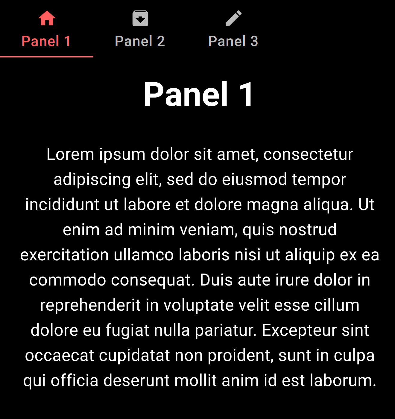
Here is the code associated to the visuals above:
function App() {
    // Define colors
    const APP_COLORS = {
        day: {
            black0: "#000000",
            black0_5: "#17181B",
            black1: "#202124",
            black2: "#282A2D",
            black3: "#2E3134",
            black4: "#3C4043",
            orange_primary: "#FF5F5E",
            orange_secondary: "#FF7B52",
            orange_tertiary: "#FFBCA9",
            blue1: "#0857C3",
            blue2: "#5C88DA",
            red1: "#E10600"
        },
        night: {
            black0: "#000000",
            black0_5: "#0E1013",
            black1: "#17181B",
            black2: "#202124",
            black3: "#282A2D",
            black4: "#2E3134",
            orange_primary: "#FF5F5E",
            orange_secondary: "#FF7B52",
            orange_tertiary: "#FFBCA9",
            blue1: "#0857C3",
            blue2: "#5C88DA",
            red1: "#E10600"
        }
    }

    // Define theme
    const theme = createTheme({
        transitions: {
            duration: {
                shortest: 150,
                shorter: 200,
                short: 250,
                // most basic recommended timing
                standard: 300,
                // this is to be used in complex animations
                complex: 375,
                // recommended when something is entering screen
                enteringScreen: 225,
                // recommended when something is leaving screen
                leavingScreen: 195,
            },
        },
        palette: {
            background: {
                default: palette.black0,
                paper: palette.black4
            },
            text: {
                primary: "#FFFFFF",
                secondary: "#BBBBBB",
                disabled: "#999999"
            },
            primary: {
                main: palette.orange_primary,
            },
            secondary: {
                main: palette.orange_secondary,
            },
        },
        components: {
            MuiButtonBase: {
                defaultProps: {
                    disableRipple: false,
                    centerRipple: true,
                }
            }
        },
        typography: {
            body1: {
                fontSize: "28px"
            },
            h4: {
                marginBottom: "12px"
            },
            h2: {
                marginBottom: "20px"
            },
            h1: {
                marginBottom: "28px"
            }
        },
    })

    return (
        <div className="App">
            <Router>
                <ThemeProvider theme={theme}>
                    <CssBaseline/>
                    <EvamAppBarLayout tabs={
                        <EvamTabs>
                            <EvamTab label={"Panel 1"} index={0}
                                    icon={<Home fontSize={"large"}/>}/>
                            <EvamTab label={"Panel 2"} index={1}
                                    icon={<ArchiveIcon fontSize={"large"}/>}/>
                            <EvamTab label={"Panel 3"} index={2}
                                    icon={<EditIcon fontSize={"large"}/>}/>
                        </EvamTabs>
                    } >
                        // Note: for clarity, this content will put in a separate
                        // React Fragment named "MainView" after this example
                        <Box paddingLeft={1} paddingRight={1}>
                                <EvamTabPanel index={0}>
                                        <h1>Panel 1</h1>
                                        <p>Lorem ipsum dolor sit amet,
                                            consectetur adipiscing elit, sed do
                                            eiusmod
                                            tempor incididunt
                                            ut labore et dolore magna aliqua. Ut
                                            enim ad minim veniam, quis nostrud
                                            exercitation
                                            ullamco laboris nisi ut aliquip ex
                                            ea commodo consequat. Duis aute
                                            irure
                                            dolor in
                                            reprehenderit in voluptate velit
                                            esse cillum dolore eu fugiat nulla
                                            pariatur. Excepteur
                                            sint occaecat cupidatat non
                                            proident, sunt in culpa qui officia
                                            deserunt
                                            mollit anim id
                                            est laborum.</p>
                                </EvamTabPanel>
                                <EvamTabPanel index={1}>
                                        <h1>Panel 2</h1>
                                        <p>Sed ut perspiciatis unde omnis iste
                                            natus error sit voluptatem
                                            accusantium
                                            doloremque
                                            laudantium, totam rem aperiam, eaque
                                            ipsa quae ab illo inventore
                                            veritatis
                                            et quasi
                                            architecto beatae vitae dicta sunt
                                            explicabo.</p>
                                </EvamTabPanel>
                                <EvamTabPanel index={2}>
                                        <h1>Panel 3</h1>
                                        <p>At vero eos et accusamus et iusto
                                            odio dignissimos ducimus qui
                                            blanditiis
                                            praesentium
                                            voluptatum deleniti atque corrupti
                                            quos dolores et quas molestias
                                            excepturi
                                            sint
                                            occaecati cupiditate non provident,
                                            similique sunt in culpa qui officia
                                            deserunt
                                            mollitia animi, id est laborum et
                                            dolorum fuga. Et harum quidem rerum
                                            facilis est et
                                            expedita distinctio.</p>
                                </EvamTabPanel>
                        </Box>
                    </EvamAppBarLayout>
                </ThemeProvider>
            </Router>
        </div>
    )
}
With added Search functionality
Adding a Search functionality at the top right of the App bar component can be done by setting the extraFunction property of EvamAppBarLayout:
<div className="App">
    <Router>
        <ThemeProvider theme={theme}>
            <CssBaseline/>
            <EvamAppBarLayout
                tabs={
                    <EvamTabs>
                        <EvamTab label={"Panel 1"} index={0}
                                icon={<Home fontSize={"large"}/>}/>
                        <EvamTab label={"Panel 2"} index={1}
                                icon={<ArchiveIcon fontSize={"large"}/>}/>
                        <EvamTab label={"Panel 3"} index={2}
                                icon={<EditIcon fontSize={"large"}/>}/>
                    </EvamTabs>
                } extraFunction={<EvamTabSearch/>}
            >
                <Routes>
                    <Route path={"/"} element={<MainView/>}></Route>
                    <Route path={"/search"}
                           element={<SearchView/>}></Route>
                </Routes>
            </EvamAppBarLayout>
        </ThemeProvider>
    </Router>
</div>
And here is the SearchView definition:
import {useSearchParams} from "react-router-dom";

interface SearchViewProps {
}

export function SearchView(props: SearchViewProps) {
    const {...other} = props

    const [params] = useSearchParams()

    return (
        <div {...other}>
            <h1>No result for "{params.get("searchText")}"</h1>
            <p>We could not find anything, please review your query.</p>
        </div>
    )
}
Note that we have added a Router and Routes objects from react-router-dom to this example as we have now 2 different views we must keep track of:
The
MainViewwith the 3 tabsThe
SearchViewwith the search bar and search results.
In this example, we have deciced to implement the search functionality as an independent view, but we could have kept it on the Main View by simply routing “/search” routes to the Main View.
This is the result:
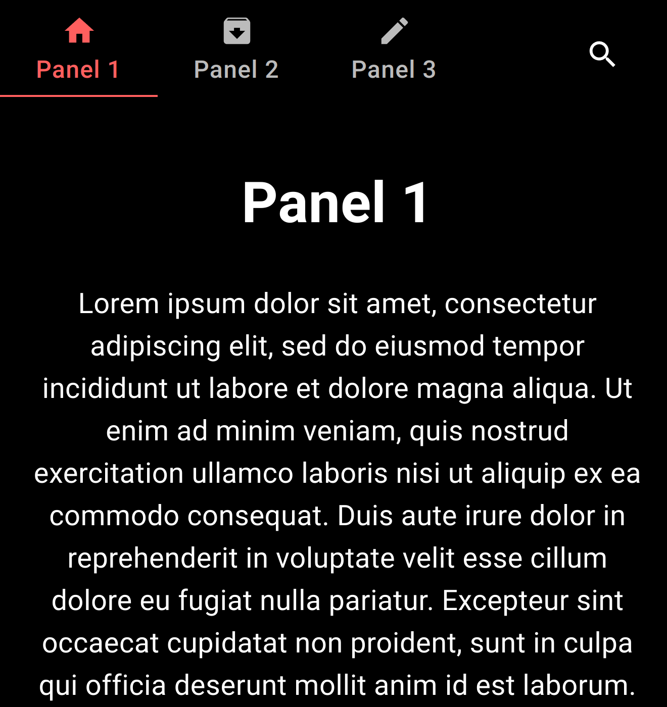
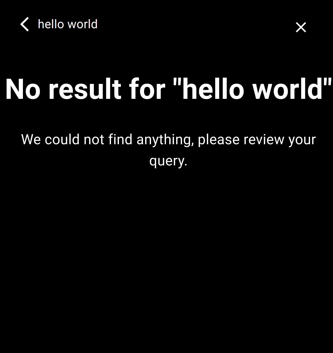
Note: the second screenshot above is after searching for “hello world”.
The EvamTabSearch component, once clicked, will automatically navigate to “/search”. And whenever the search query is updated in the input box, the path will update to “/search?searchText=<ENCODED_SEARCH_QUERY>”. For instance, when searching for “hello world”, the path will be “/search?searchText=hello%20world”.
This allows for a flexible implementation of the Search function.
Additionally, it is possible to further customize the look of the top bar when in search mode with 2 properties of EvamAppBarLayout:
searchHint: text shown when the search input is empty, defaults to “Search”showSearchCancel: set to false to hide the cancel button in the top bar.
See example below:
<div className="App">
    <Router>
        <ThemeProvider theme={theme}>
            <CssBaseline/>
            <EvamAppBarLayout searchHint={"Sök"} showSearchCancel={true}
                tabs={
                    <EvamTabs>
                        <EvamTab label={"Panel 1"} index={0}
                                icon={<Home fontSize={"large"}/>}/>
                        <EvamTab label={"Panel 2"} index={1}
                                icon={<ArchiveIcon fontSize={"large"}/>}/>
                        <EvamTab label={"Panel 3"} index={2}
                                icon={<EditIcon fontSize={"large"}/>}/>
                    </EvamTabs>
                } extraFunction={<EvamTabSearch/>}
            >
                <Routes>
                    <Route path={"/"} element={<MainView/>}></Route>
                    <Route path={"/search"}
                           element={<SearchView/>}></Route>
                </Routes>
            </EvamAppBarLayout>
        </ThemeProvider>
    </Router>
</div>
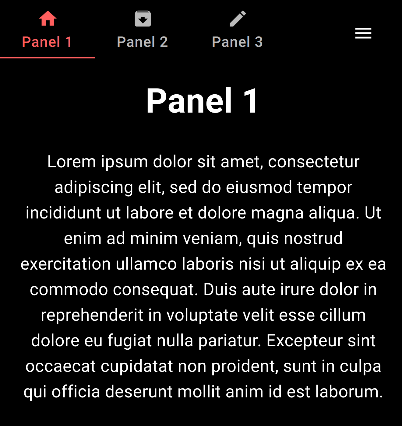
With added Menu
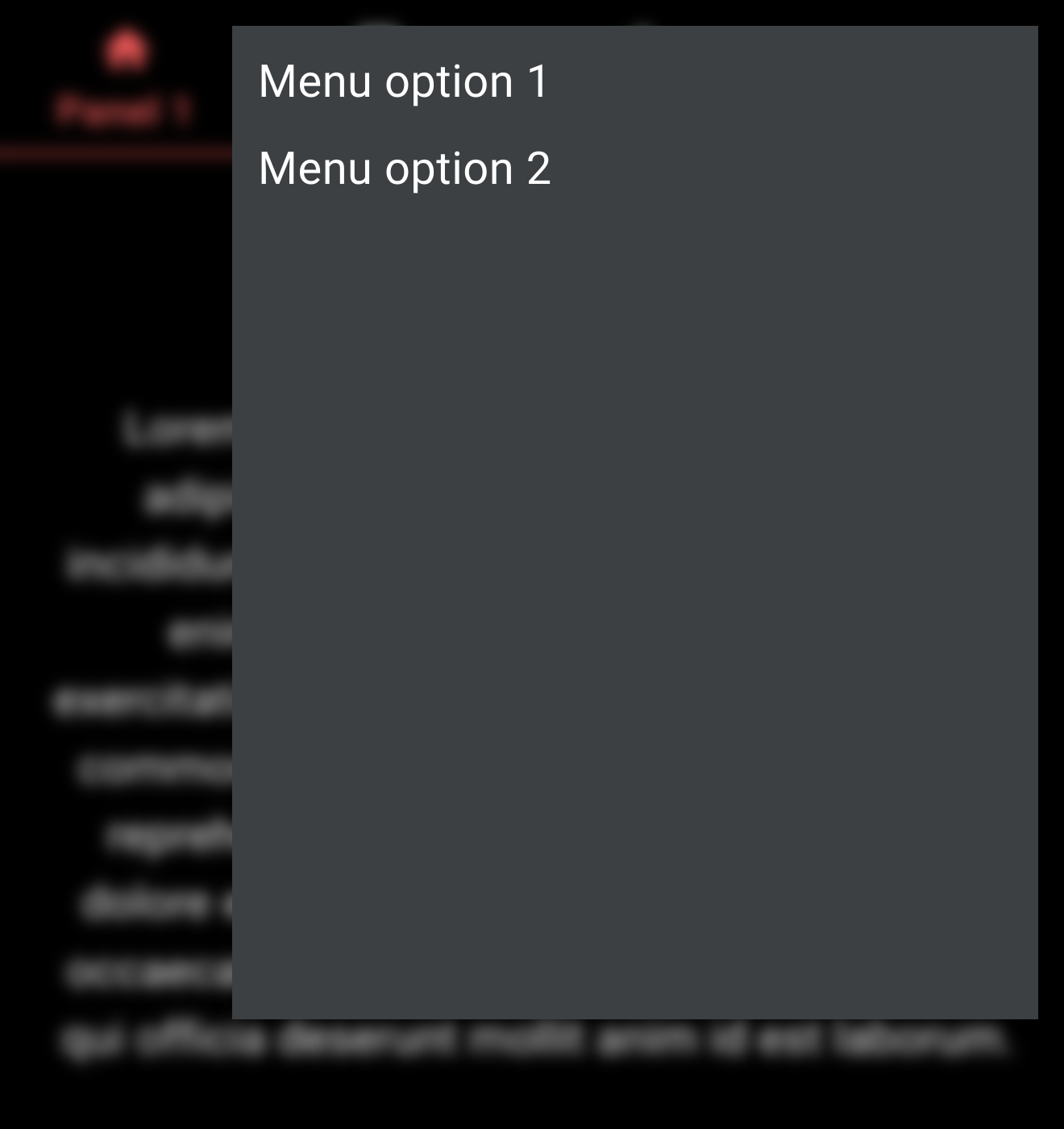
If your application requires extra navigation options, adding a hamburger menu is a good way to provide them without cluttering the visuals. It can be done with the extraFunction property just like for Search:
<div className="App">
    <Router>
        <ThemeProvider theme={theme}>
            <CssBaseline/>
            <EvamAppBarLayout tabs={
                <EvamTabs>
                    <EvamTab label={"Panel 1"} index={0}
                             icon={<Home fontSize={"large"}/>}/>
                    <EvamTab label={"Panel 2"} index={1}
                             icon={<ArchiveIcon fontSize={"large"}/>}/>
                    <EvamTab label={"Panel 3"} index={2}
                             icon={<EditIcon fontSize={"large"}/>}/>
                </EvamTabs>
            } extraFunction={
                // Simple hamburger menu layout with 2 options
                <EvamHamburgerMenu  sx={{backdropFilter: "blur(5px)"}}>
                    <Box height={600} width={500}>
                        <EvamMenuItem id={"Menu option 1"}>Menu option 1</EvamMenuItem>
                        <EvamMenuItem id={"Menu option 2"}>Menu option 2</EvamMenuItem>
                    </Box>
                </EvamHamburgerMenu>
            }
            >
                <Routes>
                    <Route path={"/"} element={<MainView/>}></Route>
                    <Route path={formatRoutePathByMenuId("Menu option 1")}
                           element={<h1>Option 1</h1>}/>
                    <Route path={formatRoutePathByMenuId("Menu option 2")}
                           element={<h1>Option 2</h1>}/>
                </Routes>
            </EvamAppBarLayout>
        </ThemeProvider>
    </Router>
</div>
This is the result:
Main View |
After touching menu button |
After selecting option 1 |
|---|---|---|
|
|
|
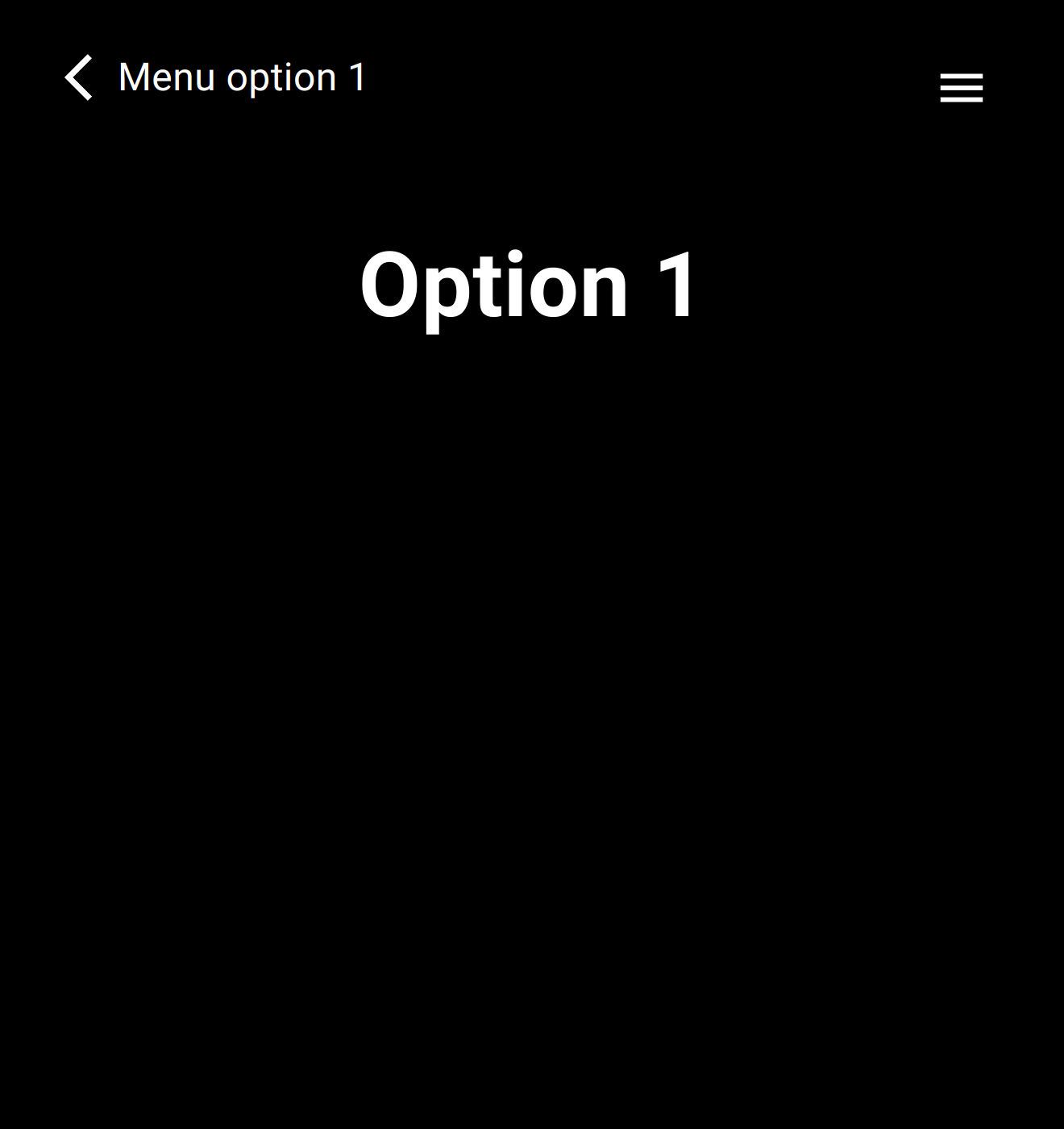
Similarly to the EvamTabSearch component, EvamHamburgerMenu also uses navigation to propagate user actions to the app:
Selecting an
EvamMenuItemnavigates to “/hmenu/<ENCODED_ID>”, for instance for a menu id “Menu option 1”, the path will be “/hmenu/Menu%20option%201”. To make it easy with routing, the functionformatRoutePathByMenuIdis available to compute the final path from a menu id.Touching the “Back arrow” goes back to “/”.
Use the Evam API
Interacting with the Evam platform is made possible through the Evam API.
It contains a set of functions to access the platform data and simulate specific events in a development environment.
The guiding principles behind the API functions are:
They should be safe to use, this means that it should not be possible to negatively affect (e.g. crash) the platform by using them
They should not require extensive tooling to be used - the Evam API is a singleton and using it in several places in your app does not require a dependency injection system (even though it will be compatible with it)
They should be reactive - this means that your application does not have to implement busy-waiting on the Evam data as it will be fed to your app when updated through callbacks
The API is entirely written in Typescript, making it type-safe (to the extent permitted by Typescript) and Javascript-compatible.
Read the Evam platform data
There are many objects that can be read from the Evam platform:
The Operation:
it describes a mission being assigned to an emergency vehicle and is meant to be a wrapper over region-specific data frames such as the SOS profiles in Sweden. Contrary to those, an Operation in the Evam SDK always has the same fields and these fields have the same types. In the SDK v1, the only Operation that can be obtained is the one currently being worked on by the vehicle (“Active operation”). The SDK v2 adds a function to observe all operations received in the Evam platform.The Settings:
your application can specify a set of parameters in its application manifest (see Setup your app metadata). Those settings will be set by the end user upon installation of you app, and the Evam platform will feed them to your app at runtime when it starts and when the settings are updated by the end user. The obtainedsettingsobject will have the same format as the settings supplied in the App manifest.The Device Role:
this is one of three values ‘SINGLE_DEVICE’, ‘RECEIVING_DEVICE’ or ‘MAIN_DEVICE’. This will be configured within Vehicle Services via the setup.The Location:
the vehicles current location, latitude, logitude, and timestamp,The Internet State:
one of seven possible values where ‘NO_INTERNET’ means no connection whatsoever. Aside from that all other states are named ‘CONNECTED_…’ where ‘…’ can be either ‘2G’, ‘EDGE’, ‘3G’, ‘4G’, ‘5G’ or ‘WIFI’.The Vehicle State:
vehicle state stores various data regarding the logged in vehicle. Such data are vehicle status, active case full id, vehicle location and whatnot.The Trip Location History:
stores an array of Location objects representing the trip history.The Available Vehicle Status list:
all the possible Vehicle Status values that can be selected by the end user. Those are typically engaged in sequence and describe, among other things, the status of the Operation (accepted, on the way to site, complete, etc).The Battery state:
details about the Evam device’s battery are provided such as its charge state, or health status.The Display mode: light or dark.
The Rakel state:
various details about the Rakel radio connected to the Evam device.
To use this SDK, instantiate EvamApi() and access its observer functions.
import {EvamApi} from "@evam-life/sdk";

const evamApi = new EvamApi();

// Register observer for active operation
evamApi.onNewOrUpdatedActiveOperation((activeCase) => {
    // Handle updated case
})

// Register observer for device location
evamApi.onNewOrUpdatedLocation((deviceLocation) => {
    // Handle updated device location
})

// Add as many API function calls as required
It is recommended you set up all needed observers onNew... as soon as your application
starts. The typical pattern is to handle each update from EvamApi by passing
the observed data in your preferred application data store, such as Redux.
Check the SDK reference for a comprehensive list of the available API functions.
Simulate events in the in-browser development environment
The Operations and Settings will be provided by the Evam platform as shown below, but you may simulate incoming Operations and Settings updates in a development environment (i.e. a web browser such as Chrome or Firefox running on your development computer). This allows you to test those scenarios with proper tooling and without needing an Evam device.
It is compatible with test libraries such as jest.
This is how you may inject such events using the API:
import {EvamApi, Operation} from "@evam-life/sdk";
import OperationState from "@evam-life/sdk/sdk/domain/OperationState";

const evamApi = new EvamApi();

// Get Evam API instance
evamApi.injectOperation(Operation.fromJSON({
    operationID: "56",
    patientName: "Test Testkort",
    operationState: OperationState.ACTIVE,
    patientUID: "900608-2381",
    callCenterId: "18",
    caseFolderId: "1",
    prio: "PRIO 1",
    vehicleStatus: {
        name: "Test status",
        event: undefined,
        successorName: undefined,
        isStartStatus: false,
        isEndStatus: false,
        categoryType: "other",
        categoryName: "test",
    },
    destinationSiteLocation: {
        latitude: 59.35393,
        longitude: 17.973795,
        street: "Vretenvägen 13"
    },
    name: "Test operation",
    sendTime: (new Date()).getTime() / 1000,
    createdTime: (new Date()).getTime() / 1000,
}))
Please note that those functions will not work when run in the Evam platform (i.e. an Evam device) and will result in Exceptions being thrown.
You can check what environment you are running in in this way:
if (!EvamApi.isRunningInVehicleServices){
    // Perform event simulations
}
Recommended workflow
The Evam SDK is built on top of the NodeJS ecosystem and React library, which provides any developer with a rich set of tools to efficiently develop and application out of the box. Developing an app for the Evam platform is very similar to developing a React web application.
Only an IDE such as VS Code and a web browser such as Chrome are needed.
One notable difference is that your application will be run and used in a mobile device (typically a tablet), with limited screen real estate. To ensure your application will look as intended in the Evam Platform, make sure to use the “Device Mode” of your web browser (example for Chrome: Device mode).
You can find out which device dimensions are available in the Evam platform in the Layout documentation in the design guidelines.
Setting your device dimensions to the smallest available ones is a good starting point.
See Development environment for more information about this development environment in-browser.